Just happened upon a sweet and simple geobrowser called Flash Earth…very smooth and easy to understand. Added bonus for me is that it links to high-res images of my favorite field area that are available only in Yahoo and Bing Maps:
Just happened upon a sweet and simple geobrowser called Flash Earth…very smooth and easy to understand. Added bonus for me is that it links to high-res images of my favorite field area that are available only in Yahoo and Bing Maps:
I do have a couple of new toys for the digital mapping crowd, but I only have time to post a totally cool aerial image of a part of Nevada that I am working in:

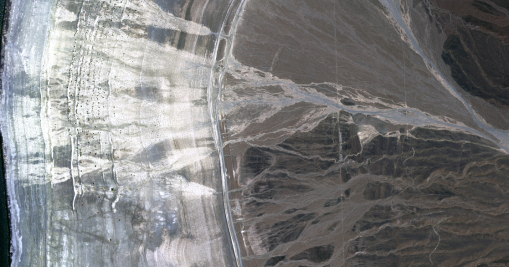
Effects of flooding on alluvial fan along the east shore of Walker Lake, Nevada
This image of an alluvial fan along the east shore of Walker Lake, Nevada is totally cool, no? Check out the way the flood interacts with the array of recessional shorelines that record the demise of the lake. Gotta grow alfalfa to feed cows to feed people, right? Surely they grow some other stuff upstream…In any case, the geomorphic signature of lake shrinkage is striking and, combined with the natural demise of the lake since the late Pleistocene, provides an obvious succession of timelines in the landscape that are quite useful for constructing a chronology of events.
Ok. I moved the blog. This is my inaugural post.
Lately I have been desperately trying to finish up some maps that are really going to get in the way as a huge project looms larger and larger…and I mean larger. Today I spent some time working on the Spirit Mountain Northwest Quad. This is one of those maps that has some intricately stacked stuff in a few relatively small areas that are separated by large swaths of planimetrically intricate but geologically straightforward surficial deposits. Also, this map has a big fat lake in it…freebie! Right?
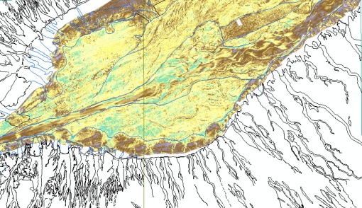
Well, no. Turns out that I am interested enough in the history of the Colorado River to have claimed that I will do what I can with what is available to map the submerged geology. Luckily, the USGS recently published a bunch of sidescan sonar data for the lake bottom: http://pubs.usgs.gov/of/2004/1247/index.htm as well as an interpretation of the imagery: http://pubs.usgs.gov/of/2004/1256/.
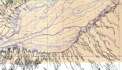
It turns out that the latter publication suffered from an unawareness of existing, pre-reservoir topographic maps. Nonetheless, their interps are good, but can be improved by evaluating the sonar image in conjunction with the historical map. Notably, the historical map is a detailed plane-table topographic survey by the USBR in 1939. It includes topography as well as some geological and ecological descriptions. Very handy. Combining these sources of data with my familiarity of the river in general and from 1939 aerial imagery of other, roughly similar reaches I can develop a map with reasonable confidence. It is actually pretty helpful to have a good characterization of the river for interpreting the lower piedmont relations.
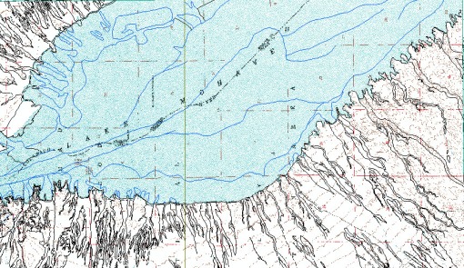
I am not yet finished with the terrestrial or subaquatic mapping, but thought I would share while I figure out a new blogging program (note that North is to the left in the maps):

DRG with draft geolines including lake bottom lines

Historical Land Survey with draft geolines and useful annotations.

Sonar image (not elevation, but intensity). Amazing stuff for a guy like me.
A colleague and I recently finished up the north half and you can check out the preliminary version here. I am now busily mapping away on the south half as well as the bottom of the lake.
Ok. So I am not so smart…big surprise. It is digital geoscience for dummies after all, and I am a geologist, not a GIS-geek. At the DMT meeting last week I was able to have several head-to-heads with some well-trained ESRI representatives. I learned more than I can remember now, but the key thing I learned is the value of the network connection/ gis server function in ArcCatalog. Yes, I have always seen it and always ignored it. Whoops. With recent developments at ArcGIS online, you can link your mxd to various streaming sources of data. If you use ArcGIS, you need to check out ArcGIS online.
I started to get a whiff of this when using Topofusion (see previous posts) and, more recently, Global Mapper, because these programs can load imagery in the background of your project when you are online. Anyway, check this out:

The image above shows my Ivanpah Valley, NV megamap (the flood hazard version) at 1:250k with high resolution ortho imagery in the background. Also, check this out:

ESRI provides a decent data set of shaded relief for the globe. This is what southern Nevada looks like. The shaded relief looks considerably better when zoomed out over a larger region and makes a great overview map.
You can also ‘be served’ some pretty decent satellite imagery, as shown below:

So, how does this work? Pretty freaking simple. Create Network Connections in ArcCatalog. You just need to decide if it is an ArcGIS server, an ArcIMS server, or an WMS server. Then you simple add the server data source to your active project much as you would imagery or data hosted on your desktop computer. Of potentially great interest is the fact that you can connect to seamless.usgs.gov and choose the data type that you want to add from a long list.

Note: The high resolution imagery available at ArcGIS online is the new color NAIP orthoimagery (I’m pretty sure), so it is completely viable as a geologic mapping supplement. I wish I had known about this long ago. Being self-taught in GIS has its disadvantages. If any of the 4 people out there who may look at this blog know of any other online map services of value to geologists, let me know.
Smooth Your Image:

To get the most most out of your base imagery, you need to experiment with different image enhancement tools in Arc. The basic manipulations can be found under the ‘display’ and ‘symbology’ tabs found under ‘layer–properties’ (right-click on the layer of interest). To smooth the image without any negative effects, choose the ‘bilinear interpolation’ option and then click ‘apply’. This will smooth your image in a visually satisfying way. Other resampling options may result in bothersome artifacts in the typical types of imagery that geologists use for mapping.
Stretch Your Imagery:
 Stretching your image can create levels of contrast and color balance that you will appreciate. For details, consult a remote sensing textbook. For now, just accept the fact that you can vastly improve an image’s appearance by applying a standard deviation stretch to your data. Start with n=2 and experiment with increasing and decreasing this value. Also, if you limit the stretch statistics to the ‘Current Display Exent’ you will get ~local results that typically improve the contrast of the image. This will vary with the absolute range of values present in the current display. Experiment with other stretches.
Both of these enhancements are useful for b/w DOQQs, color DOQQS, and Quickbird data among (presumably) all other remotely sensed base (photo-like) imagery. It is not useful for DRGs.