Skip navigation

Category Archives: digital mapping

For better context, here is a 1:1,000,000 map of Clark County showing where the area in the previous post is located. The map we are trying to complete as Phase 1 of the Nevada Digital Dirt Mapping Project will be approximately 1:150,000. The tiling evident in this image is because the data are divided into the appropriate 100k sheets. For more background on the project, check out the Nevada Digital Dirt Mapping blog. Yes, there is some cross-posting going on…how else could I manage all of this stuff?

Recall when I went on ad nauseum about my struggles with the Lower
Walker River map as I was trying to document (in part) the struggles
that the lower Walker River has had in dealing with its shrinking
lake? If you missed that fun, experience it here:

http://geofroth.posterous.com/tag/walkerriver

Well, I hardly made a peep about this map…mainly because it
was finished earlier and was out of the ‘buffer’ at the time. But now,
it has reached a comparable state of completion.

The twist with this map (which is along the lower Colorado River
between Hoover and Davis Dams) is that the river has lost its battle
with a lake by virture of having been dammed downstream. Thus, all of
the bluish-greenish units are submerged under the lake.

I was able to map these features with reasonable confidence using
sonar data and large-scale, pre-dam topographic maps of the valley.

Interesting side note: Since getting the map to this point, I have
gotten my hot little hands on a pre-dam aerial photo mosaic of the map
area.

Revision time!

Posted via email from Fresh Geologic Froth

It was recently brought to my attention that the graphing tool in ArcGIS could be really useful if you had the right type of data (thanks to ND at UO). Well, I spent most of today trying to refine a longitudinal profile of the Owyhee River from my coveted LiDAR data set, and it occurred to me that I had some useful data.

My goal beyond just examining the profile was to indicate the locations of major landslide complexes along the river corridor to investigate how they may influence the river’s gradient.  I actually extracted the profile data from the data using a tool in GlobalMapper which I like. I converted the data to an excel spreadsheet, opened the sheet in Arc and then exported it into my Geodatabase as a feature dataset. Once it was in there, I created a graph of the data (basically the profile) and began to select points on the profile along key reaches that I had mapped. Lo and behold, those points i selected on the map lit up in the profile graph. Sweet. This was huge. It goes both ways as well. Select points on the graph, and they light up on the map.


Restrict the displayed points on the graph to those selected on the map and you can export them as a subset of the data. This step comes in really handy for plotting the exact position of the landslide complex-reaches on the overall profile figure. Previously, I had stupidly brute-forced this process. Typical. The result is below:


Also very useful is to plot the profile data in the form of cumulative distance vs. slope of channel segment. This graph immediately indicates important trends and anomalies in the data. Turns out that the anomalously high slope values and negative slope values relate, in this case, mainly to inadvertently collected data from vegetated bars, extremely coarse gravel bars, and even wave trains at some of the rapids. Thus, an important and informed QA step can be taken to clean out the riff-raff. In general, though, you can see how useful this method is for zeroing-in on areas of key interest. For example, many of the points on the map below correspond to rapids


Posted via email from Fresh Geologic Froth

Just happened upon a sweet and simple geobrowser called Flash Earth…very smooth and easy to understand. Added bonus for me is that it links to high-res images of my favorite field area that are available only in Yahoo and Bing Maps:


Seems my pals at Google still just don’t care about SE Oregon. Anyway, I found the site by perusing the details in an exif header in one of my geotagged photos. Was checking that out in Irfan View, a program I was aware of but hadn’t tried yet. Turns out, it is well worth a look:


Which led me to the GeoHack wiki:


The internets are amazing, no? Totally cool.


Posted via email from Fresh Geologic Froth

It is tortured river season in my office. Lately, I have been tackling Nevada’s mighty Walker River and its shrinking terminal lake (new term is terminus lake…but that is a bit soft); and Oregon’s Owyhee River and its travails with lava and landslides; but now I am back on to the Mighty Bill Williams River of Arizona. You know, the Bill Williams River.

Included below is a snippet of the map I am working on. Shown are 6 generations of lines that document major changes in the channel, most since a dam was finished in the late 60s. One day soon, this map will actually make sense, I promise.


The BWR is a special case. It is a roughly 35 mi stretch of river that traverses the hot desert below the confluence of two rivers that collectively drain more than 5000 square miles of western Arizona. Alamo Dam sits just below the confluence and traps essentially all of the sediment that would otherwise have gone down the BWR and to the Colorado River (well, at least to Lake Havasu). Also important to note is that the pre-dam BWR could attain peak discharges ranging up to 100,000 cfs, whereas the post-dam BWR can hardly exceed 7000 cfs owing to the outlet works of the dam. Thus, large runoff events that would have otherwise blasted through the system in a week or less (Spikes) are now converted to protracted, flat-topped hydrographs that lumber through the channel for up to several weeks to months (Bricks). Recall that these bricks are also sediment-free except for the sed picked up in the channel below the dam.


The result is an interesting experiment in channel change, sediment budgeting, and inadvertent (or otherwise) tamarisk farming.


I won’t be posting daily updates of this map, so don’t worry. Be assured, however, that I will make a lot of noise when I finally finish it. This one is a long, long, long, time coming. Just ask the sponsors.


Some other BWR info:


Posted via email from Fresh Geologic Froth

Sure, I have gone on and on about the amazing visualizations you can get with some tweaking of LiDAR data; however, it turns out that a pretty basic representation is also quite useful…contours. Yes, contours. Sometimes smaller scale features remain somewhat ambiguous in hillshades or slopeshades, but high-res, short interval contours from the LiDAR data can eliminate most of the ambiguity. In this case, it is a tiny area that I have struggled with on the Owyhee River. Here, a large landslide entered from the north, shoved the river channel to the south, and the river eventually worked its way back to the north to some extent. The array of surficial deposits in the void that comprises the right hand side of the image south of the river record this sequence of events as well as subsequent sedimentation by tributary fans. The contours really highlight the fans, and in conjunction with discernible drainage patterns evident in the LiDAR, it is clear what is fan and what is river, right?

2-m Contours were generated in GlobalMapper and exported as shapefile to view in Arc.
Note, Ian Madin (at DOGAMI) gave me the tip on contours especially as they relate to resolving fan features. He was right…it works!

Posted via email from Fresh Geologic Froth

I created this lake by generating a contour from the LiDAR dataset at an elevation of 1046 m. GlobalMapper does this in about 1.5 minutes. Then, exported the vector as a shapefile, cut out the parts of the line that occur downstream from the dam, stitch the remaining loose ends, build a poly from the line and there it is.

This lake has an interesting topographic correspondence with the old landslides on the south side of the Hole in the Ground as well as the ancient fan remnants that come in from the north side. Don't forget that much of the topography you can see through the lake didn't exist at the time of the lava dam. The valley floor was probably formed on the Bogus Rim lava which forms the flat-topped features that flank the left and right banks of the river near the eastern end of the lake. The top of the Bogus Rim lava is only about 25 m below the surface of this lake. Thus, the link between this lake and the landslides is dubious as there was nowhere for the landslides to slide.

Posted via email from Fresh Geologic Froth

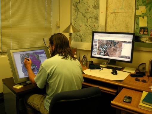
I recently acquired a Wacom Cintiq Interactive Pen Display and it was worth every penny of the $1999 that it cost me. Sure, that sounds like a lot. However, I work on a lot of maps. Without going into detail, I will just note that my commitment to over-commitment is a problem. I truly need to develop ways to more quickly and accurately compile my mapping in a digital form.

Nothing (aside from LiDAR, maybe) has streamlined my mapping workflow more than being able to map directly on the surface of a high-resolution monitor. It is one-step beyond my previous advice to run out and get yourself a wacom digitizing tablet because it removes the final level of abstraction that separated your eyes from your work. Since the monitor is quite pricey, it may be a stretch for the average ‘joe’ (you know who you are). The next best step, the digitizing tablet, is an excellent way to go if that is your limit. Put plainly, you are a pitiable fool for not using either of them. Sorry to say that, but it is true.  Deal with it.

I will admit that some of my colleagues that I have goaded into trying the tablet (haven’t let anyone touch the monitor yet) have had some issues and, unbelievably, returned to clicking their freaking mice for miles across the virtual landscape. As I have said in the past: can your write your name with your mouse…of course you can’t. Why then do you think you can map your favorite intricate contact with one better than you can with a pen? The digitizing tablet / monitor approach is far more efficient. You can program buttons on the pen and the tablet to substitute for frequent commands you use in the program of interest. In the case of the tablet, you can change its inclination to suit your ergonomic needs and can even freely rotate it through a large range of angles to get the perfect attack on the cryptic  contact you think is so important.

The Cintiq rocks for geologic mapping. Convince your boss to buy one, or write it into your next geologic mapping proposal. Don’t be a slave to a mouse…how embarrassing is that?

Disclosure: I am left-handed but also moderately ambidextrous. I use my mouse with my right hand. I use the pen in my left. I use them both when madly mapping in ArcGIS.

Dr. Jerque hard at work

Note from Kyle: A new contributor has entered the froth! I think he is smarter than I am…

We’ve all read Kyle’s rants against paper maps, and we’ve all seen some of the potential for online, digital mapping by using websites like MapQuest or software like Google Earth. So if we want to try and step away from producing flat, paper maps and want to be able to share our digital geologic data with each other, what kind of format are we going to use? The answer is that we’re going to need to learn to use map services.
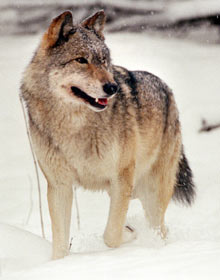
Your users are desperate to get your data

Your users are desperate to get your data

What is a map service? Think of it this way: Your map and data exists on a computer somewhere that everyone can see over the Internet. Everyone wants to see your map data, but you can’t just open the barn doors and let them all tear into it. Think wolves starved by the longest, harshest New England winter suddenly turned loose inside the barn where your sheep have been warm, toasty and chubby for months. This just won’t do. Instead of a wild feeding frenzy, you need some organization. A map service provides organization by specifying how to ask for the data, and how it will be returned. In these terms, a map service lets the wolves have all the sheep they want, as long as they ask nicely.

This allows for a variety of client applications (for example your web browser, Google Earth, or ArcGIS Desktop) to provide an interface by which people can look at your map data. As long as an application knows how to ask the right questions, and what to do with the answers, it will be able to view the map.

Map services are an important step in moving our geologic maps off of paper and getting them online. They allow us to share both our data and our cartographic work with each other. Ever downloaded a “map package” that consisted of an indecipherable slew of files, databases, interchange formats, acronyms and cryptic field names? Well map services are the solution, providing not only an image of your map, complete with all the cartographic work you put into it, but also a simple interface for grabbing the data itself.

At the Arizona Geological Survey, we’ve put together a map service for the geologic map of the State of Arizona. You can view it here:

AZGS Map Services: Geologic Map of Arizona

Quickly and easily view and query the map within ArcMap

Quickly and easily view and query the map within ArcMap

In the future we’ll be putting together more and more of these services, and including with them more information – photos, field notes, descriptions of important contacts and structures, etc. Perhaps the most intriguing part of all this though, is how easy it is to create these map services. If you have a functioning web server and have access to ArcGIS Server, then you have absolutely no excuse not to start figuring out how to use it. If you don’t have a web server or ArcGIS Server, well, stay tuned, because the AZGS is also working on putting together a software package, or “stack”, of entirely free, open-source applications that do very similar things to what ArcGIS Server can do. Our goal is to make it possible for everyone to begin exchanging maps and data using map services.

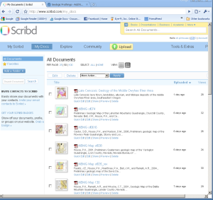
I recently came across Scribd while reading the New York Times online (during lunch of course). Turns out that this is a very useful site to store and easily share a variety of documents. Given my obsession with maps–both analog and digital–I investigated further and soon started uploading all of my maps that are worth uploading. It is simple to say the least. It also turns out that it is simple for someone on the other end to comment on your map, to download your map, and to send it to their plotter / tree-killer. You also have the option to make your uploads private so that you can only share a map, poster, document, etc., with selected colleagues.

2-13-2009-12-12-33-pm

The interface takes a few seconds to minutes to figure out. It is a cleaner, more efficient, and more user-friendly interface than the one hosted by my agency. It may not be for you, however. It also requires that you are willing to freely provide maps showing data that were compiled with (usually) tax-payer money. Hopefully the extreme budget crisis facing my state will not force me to pull down the free maps.  Check out my uploaded maps using the Scribd link in the right sidebar.